Accessibility
Headings
Last modified 12/5/2024
When tackling accessibility in your web content, headings are an easy way to start. Headings, also known as paragraph styles, are much more than big bold titles on a page. They work to provide a solid structure and a logical outline to your document. Headings help people scan your content more efficiently.
Heading Organization
Organizing your digital content with a heading structure helps people get a sense of organization. It is crucial for the structure to be portrayed both in a visual and technical manner, so the organization can be viewed as well as allowing screen reading technology to be able to identity the structure as it reads it out loud. To help improve searchability, try to begin your headings with keywords.
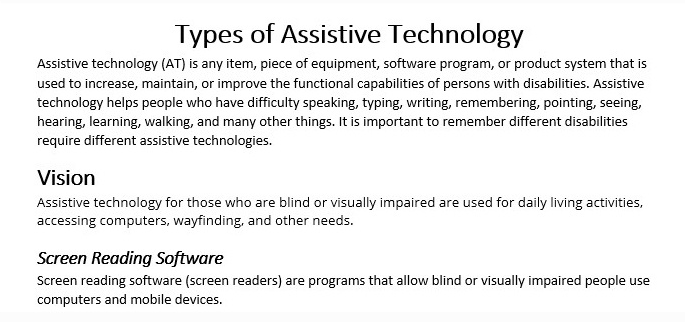
Headings should be used in a hierarchical manner. In most cases, there should be one Heading 1 per page (some digital documents may have more than one Heading 1). Headings 2 and beyond are nested underneath their respective Heading 1. In the example below, the main heading is titled Types of Assistive Technology. Beneath that is Heading 2 titled Vision and a Heading 3 titled Screen Reading Software.
Styling Your Headings
Visually, headings appear larger and more distinct than surrounding text. Making texts larger helps guide the eye around the page. Those who can see the page often skim through headings and sub-headings and look for significant words pertaining to the information they are seeking. Breaking up the document with headings allows for this easy scanning visually.
Headings should be used to separate your content into meaningful sections. It is important to not use bold styling instead of a heading style! One of the most common accessibility mistakes is only making text a bold style when a true heading is needed. The text may look like a heading, but the underlying code is not set correctly, and screen reader users will not benefit.
Why It's Important
People who are blind or have low vision also greatly benefit from heading structure because they navigate through the headings using a screen reader. This allows them the ability to scan a document quickly, or to go directly to the area that interests them the most. If headings are not present, there is no way for a screen reader user to skim a document’s content, so they must listen to the entire document top to bottom in order to find specific content. The following video explains why proper structure and headings are so important in developing accessible materials and websites.
Resources
-
Format Headings Styles in Microsoft Word (Accessibility)
-
Edit Headings in Omni Campus CMS (Accessibility)
-
Format Headings Styles in Microsoft Publisher (Accessibility)
-
Format Headings in CampusPress (Accessibility)
